In Part 1 I discussed the issues I had with my current pseudo-axial lighting setup, namely that the requisite hole in the middle of the flash adapter that allows the lens to image the coin results in a “blind spot” in the centre of the coin where nearly-axial light cannot reach the coin and reflect back to the lens. The centre of the coin does receive some light but it’s at an angle greater than what might be called “pseudo-axial”, and this reduces the contrast-enhancing effect of a pseudo-axial lighting setup and produces flat-looking areas in the centre of coins. Key to any good numismatic photo is the perception of depth, highlighting the relief of the coin no matter how small it may be.
I covered the theory behind pseudo-axial lighting in that previous post so if you have not read it yet, I recommend starting with it first. I also address some of the limitations of this setup and what I have tried over the years to improve upon it. In this part, I will detail the new design I ended up on and discuss how it addresses some of the limitations of the previous setup.
Improving Pseudo-Axial
The original design didn’t really direct light in a certain direction, rather the flash would bounce off the perpendicular walls of the flash adapter and, in my estimation, eventually bounce out of the adapter and down towards the coin where hopefully some would be reflected back. One idea I toyed with a lot is directing the light to the coin using angled surfaces inside the flash adapter. For example, instead of having vertical walls inside the flash adapter, what if it was a 50 degree slope? If it were 45 degrees, it’d direct light axially towards the coin but the light would miss the coin entirely since the angle surfaces in the flash adapter can’t be over the coin itself – so, we need a slightly wider angle to push the light towards the coin. The 50 degree slope did direct more light towards the coin in a controlled fashion, however the curved walls of this design meant that a lot of the light would be reflected in unwanted directions away from the coin. Instead of a curved design like a ring light, I needed sloped walls that were straight, i.e. the axis of the wall was perpendicular to the direction of the light coming from the flash.

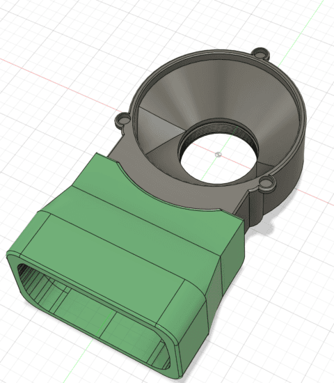
What this means is that the 50 degree slope may as well be flat and perpendicular to the flash head, not curved, to maximise the sloped surface area that can redirect light towards the coin. One could get rid of the “ring” and make it a box shape with the wall furthest from the flash a flat sloped surface. This would mean there’s only one surface reflecting light to the coin, the wall opposite the flash, so there would no light reflected from the sides as there is in the current ring light design. This might mean not enough light would be reflected onto the coin, or perhaps only enough to cover half of the coin.
The First Prototype
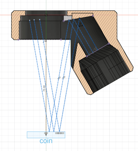
Instead of mounting the flash horizontally and having it send light across the flash adapter to be reflected down onto the coin, I instead mounted the flash under the camera at an angle and used a more minor sloped surface to reflect the light onto the coin. This design allowed me to make the adapter much more compact. The angle of reflection off the sloped surface is the same as in the above design with the 50 degree sloped walls, even though the slope of the reflecting surface/wall is different. In both cases, the reflection angle off the sloped surface is 80 degrees meaning the incident angle of the lighting hitting the coin is also 80 degrees, so the light that then reflects of the coin is only at a 10 degree angle. Using the geometry of the design, I can also block light that would not hit the coin (since most of my coins are about 30mm diameter or less), preventing any stray unwanted reflections that might happen if I allowed this light to be reflected.
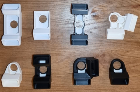
I tried various iterations of this design: one flash head, two flash heads, a box shape, a circular shape, two lights opposite each other, two lights rotated around the lens 45 or 60 degrees to each other, and then using black plastic for the everything except the reflecting surface I wanted light to bounce off. Making the flash adapter entirely black except for the reflecting surfaces was a big improvement that I had failed to try earlier. Though with my earlier designs I was encouraging some random light reflections so as to lessen the harsh contrast of pseudo-axial lighting. However, these stray reflections were largely adding to the “flatness” problem I described earlier and I found that making the body black except the one surface I want reflections to come from made a huge difference to reducing the flatness problem by way of increasing contrast through limiting stray reflections.

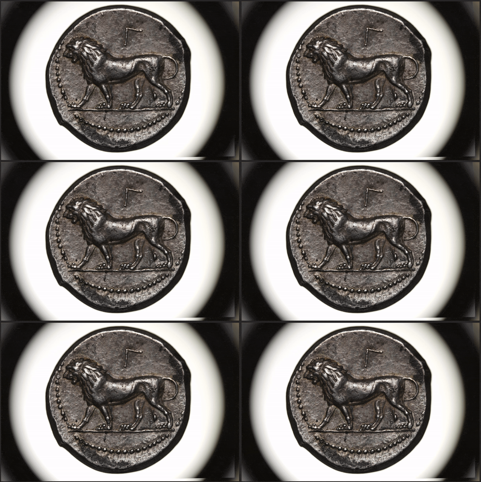
The GIF below provides a comparison of how an all-white flash adapter differs in “flatness” versus a mostly-black flash adapter. The slightly yellow photo is from a white body, the greyer photo is from one of the black bodies with white only on the reflection surface. The area to pay attention to is around where the lion’s front leg joins to its body – the shoulder joint and chest area. Note in the more yellow photo this area seems slightly flatter, while in the other photo you can get a hint of the contours of the lion’s chest and shoulder joint. This is from the better control over the axial light and minimization of unwanted reflections.
Testing
Now it’s time for some tests/examples. I’ll start with an example shot using a proper axial light setup, i.e. with a piece of reflective glass between the lens and coin. And then I’ll go through some “pseudo-axial” setups, starting with my current flash adapter, one of the new prototypes I made, and then a final design that I’ve roughly settled on for now.
To make sure we’re on the same page when I highlight particular areas of the coin in the comparisons, the parts highlighted in red are my main focus. These seem to be the flattest areas of the design and areas where I want to try and capture some of the contours that are actually in the relief of the design but can appear flat in some lighting situations.

Axial Lighting – First up is the pure axial lighting setup. There’s great contrast around the designs, the toning is really brought out of the surface, and the focus areas mentioned above don’t appear flat at all except for in small parts. The front leg of Baal, for example, is nicely rounded and the definition and depth can be seen in his chest as well as the lion’s. The main negative is that the toning seems too strong in places, such as the red, oranges, and blues on Baal’s head, chest, and the lion’s body. As mentioned in Part 1, axial setups like this do reduce sharpness and detail, though it’s practically unnoticeable unless zoomed in to “pixel peep”.
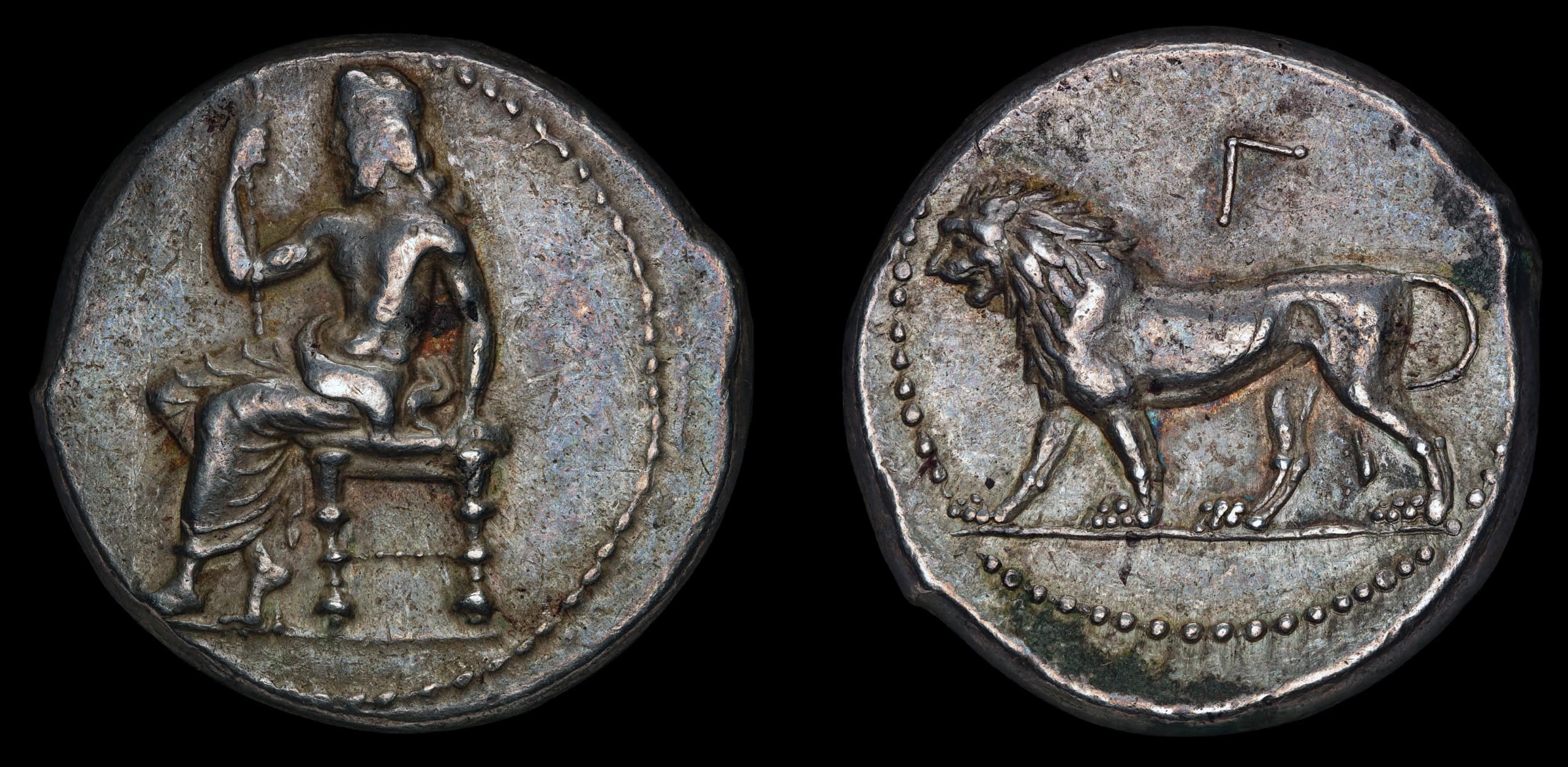
Pseudo Axial 1 – This is using my current flash adapter, the one I’ve used for most of my photos and which is the focus of this blog series on finding a better solution. It’s still a nice photo with great contrast around the figures and the toning is preserved but much of Baal, and parts of the lion, seem featureless and flat. Baal’s chest and front leg in particular have large areas of “flatness” but also his arms, the lion’s limbs, Baal’s head and other areas are all quite flat looking.

Pseudo Axial 2 – This photo was captured useing the black prototype in the bottom row 2nd from the left seen here. It uses two flashes positioned 180 degrees from each other, each reflecting light that should hit the coin at an 80 degree angle. For this photo they were positioned at 12 and 6 o’clock, i.e. top and bottom. Compared to Pseudo Axial 1 (PA1), we have less contrast around the figures but also less flatness. We get some definition back in Baal’s legs and chest and the lion’s shoulder, chest, and hind-area represent the contours of the body just a bit better. It also keeps much of the toning but the surfaces of the obverse in particular look a bit more natural than in either the PA1 photo or the Axial Lighting photo.
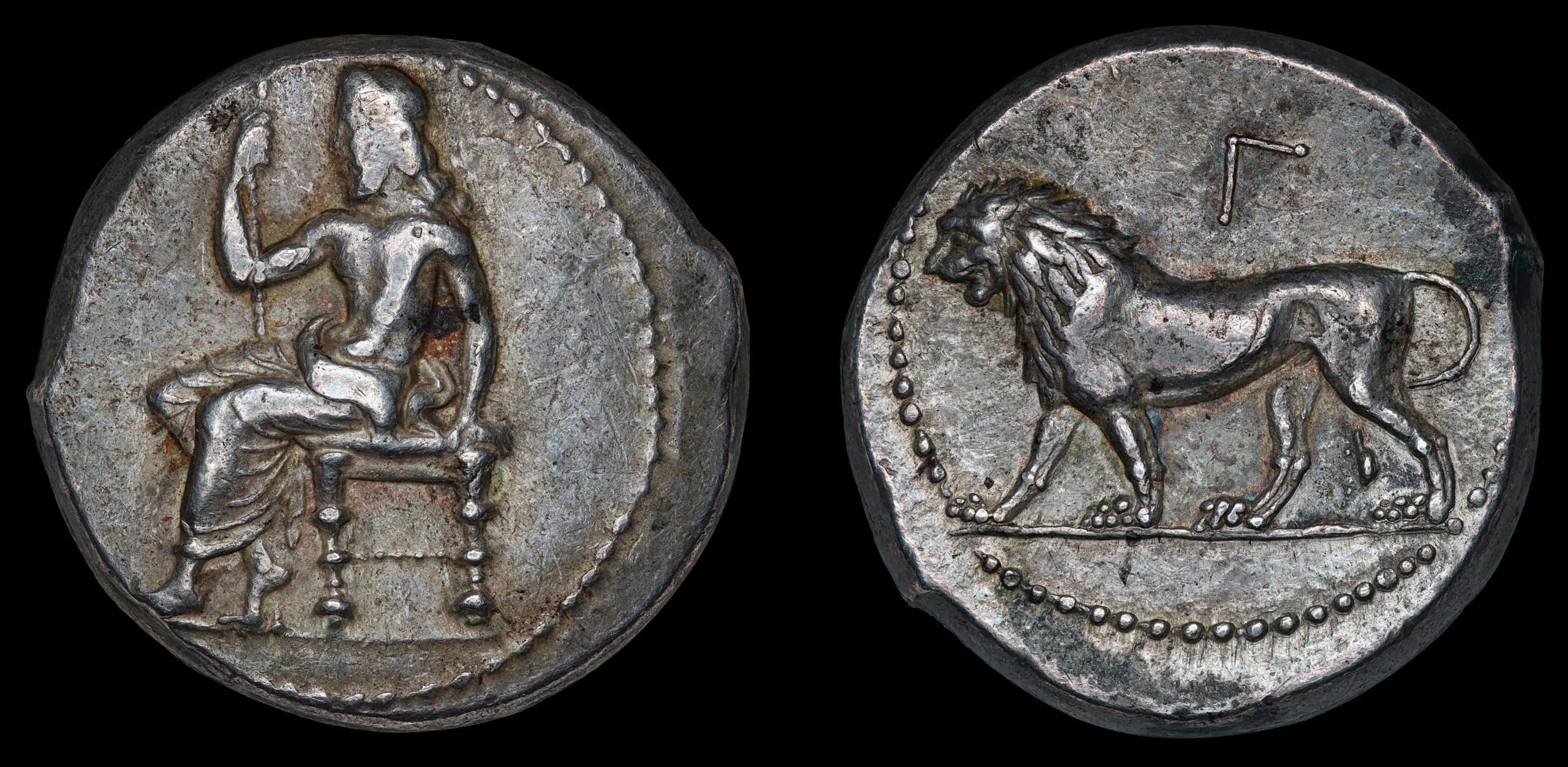
Pseudo Axial 3 – Finally we have what I think is the “winner”. It’s the black prototype in the bottom row at the far right in this photo, i.e. a single flash version of PA2. I believe this one balances the pros and cons of axial lighting best. It has the least amount of flatness out of any of the Pseudo-Axial examples while maintaining the toning and contrast. Compared to PA2, the lion has extra contrast on the underside as we’re no longer lighting from that direction, only the 12 o’clock direction, but this results in much better depth being perceivable across the lion’s trunk and limbs. The downside is mainly on the obverse where the axial effect struggles to make the surfaces pop near the bottom of the coin as very little direct light can reach here and what light does likely bounces away from the lens. Nonetheless it’s still possible to get a relatively evenly-lit photo while the majority of the reflected “axial” light is theoretically only targetting the top half of the coin.

GIF Comparisons
It can be difficult to see some of the nuanced differences from images side-by-side so the GIFs below each alternate between two photos to make it a bit easier. The GIFs compare one of the first 3 tests above to the final test design, “Pseudo-Axial 3”.


The prototyping does not end here, though. Soon after coming up with this design, I had an idea of using the opposite side of the flash adapter to also reflect some light onto the coin rather than using a second flash head in this place. Part 3 will go into detail on this discovery and show the design that I ultimately settled on and have been using for the past few months.
Stay up to date with the latest news from Artemis Collection by subscribing to the newsletter.
